solomotos
Milpostista
Sin verificar
Hola a todos, en mi búsqueda del tema relacionado a las laminitas o biceles de lamina de algunas de las antigüedades que todavía algunos siguen portando o guardando en el cajón, me permiti subir el tema que tanto trabajo me costo encontrar, pero al fin lo encontré. De hecho este es el que mas me gusto y el mas completo.
Espero lo disfruten o lo utilicen algún dia para poder identificar las laminas de los submariner en cualquiera de sus presentaciones.
Disculpen el no haberlo traducido, pero aparaecen palabras demasiado raras para el tema una vez que se traducen del idioma ingles.
Saludos desde el país mas corrupto y vendido de todo el mundo, donde simplemente nunca pasa nada.
Dejo el link para formalidades del foro. https://www.watchprosite.com/?page=wf.forumpost&q=&fi=732&ti=849983&pi=5769208
The Rolex insert is one of the most recognizable aspects of a Rolex Submariner. Often imitated but never duplicated. The Rolex insert is a mark of distinction across the world and the Rolex Submariner is the most recognizable when it comes to dive watches. It was an essential tool for divers to safely calculate their dives long before computers and other sophisticated tools took over.
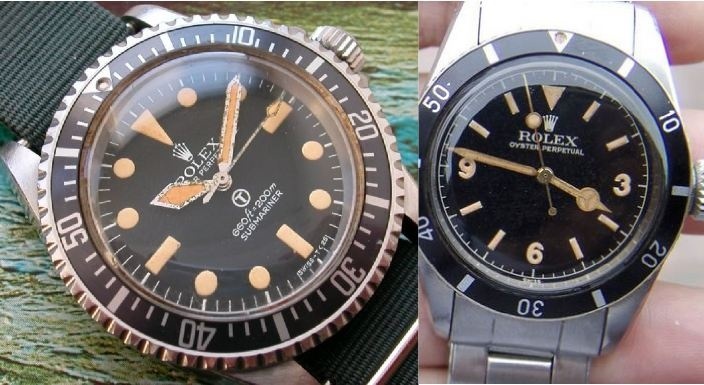
Some of the very early inserts from the 50's had no markers between the 0-15 they just had individual marks every 5 minute increment. Also we have the famous Red triangle that adorned the Rolex big Crowns in the 1958 – 1959 period. And of course the later Military insert for the 5517 issue with marks at every minute.
source:internet credits unknown .. will credit if noted. pic for reference only
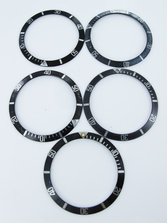
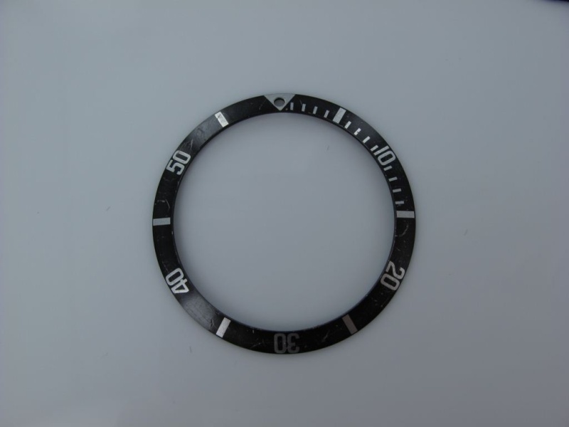
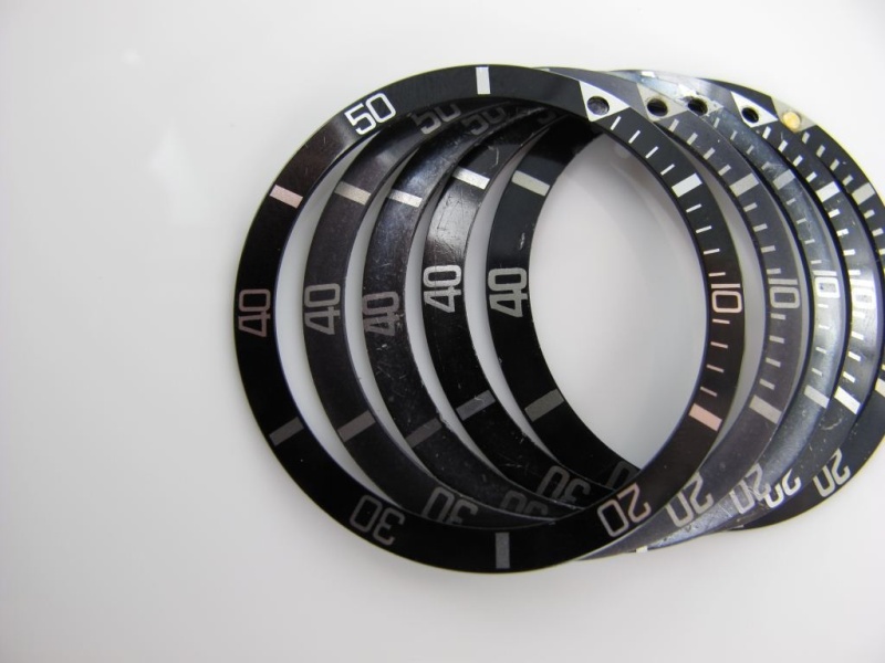
The focus here will be on the inserts that were fitted to the 5512, 5513, 1665 and the 1680. As always with Rolex I must preface this exposé with the fact that we are talking about Rolex and nothing is definitive so please enjoy this review as a guide of an opinion formed by experience. I will use the nomenclature of MK1-3 as it seems to be widely accepted. I will also sneak in a Mk0.5 as one that may have come just before the MK1 but still not stepping on the red triangle insert. However as there are possible variations please feel free to add your comments. Also the inserts are prone to fading and come in an abundant array of shades of gray/black but again I am focused on the base models. They also have a range of pearls that would be affixed tritium and luminova among the most common. I will not covet these accoutrements just the inserts here.
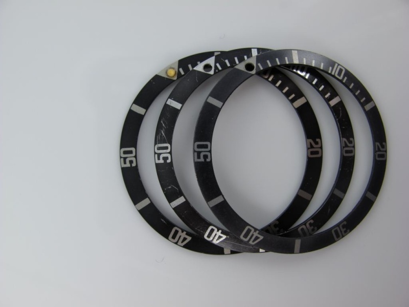
First and most important is to cover main buzz word "Fat Font". What the hell is it with Rolex and fat this and fat that. First the lugs now the fat inserts. Well, when dealing with the time period of the late 50's to early 70's the standard was fat font which I will describe in a minute. Actually I will let the pictures describe it in more detail. The rage on inserts MK1 through MK3 are all fat font with only the service insert being skinny. Again of the vintage period in question. There are degrees of fat which again will be illustrated.
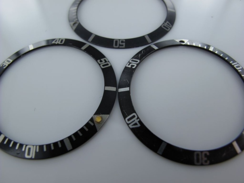
Rolex 5512/5513 Insert - Fat Font MK1
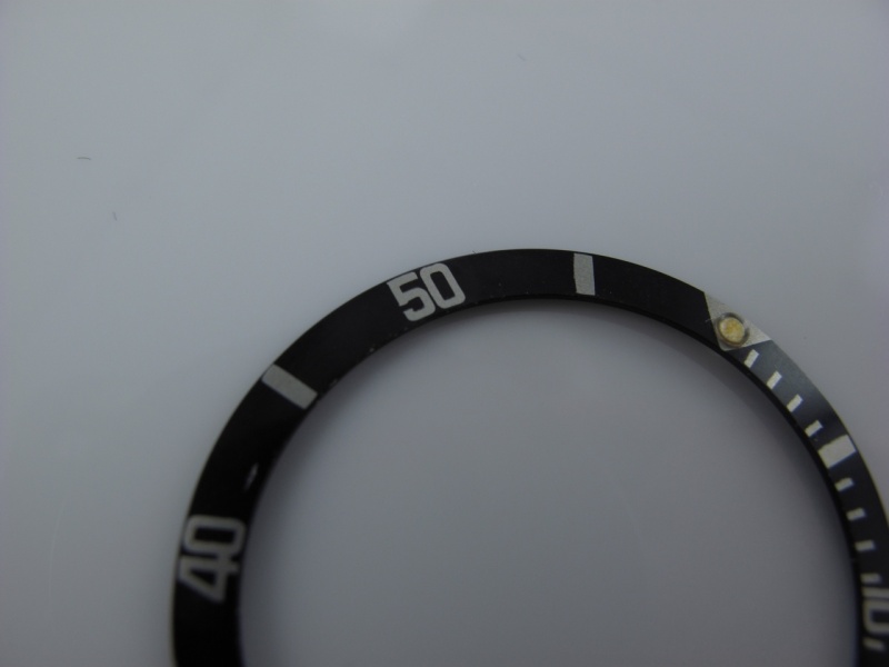

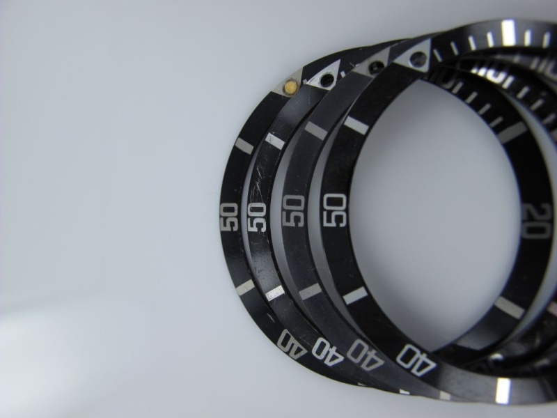
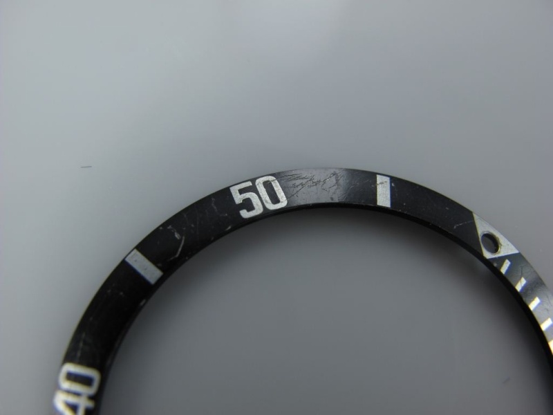
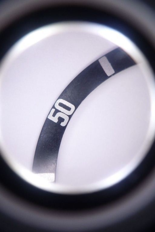
The fat font insert on the above is the early "kissing 40 font". Very rare to find holding the position just after the early Subs after with the red triangle. Here I will present the reference model which is widely accepted as the MK1. This model would have been present on the early 1960's submariner like the 5512 from the gilt era. This would include most likely the 5513 of the same period i.e. a gilt Swiss only ending around 1963/64. Not very common to find these intact on many watches of the period. Key elements to observe is the shape of the five which has a small square with think font. The number forty have the "kissing distinction". I think we can all agree to call this one the MK1. If we then assume the the variations we call MK2 and MK3 as simple slightly less "fat" i.e. the font is from fattest to fat we can draw the distinction. However, I don't have a solid theme to say which watch had which of the inserts exactly what year but you can also assume that the period late 50's through maybe 1961 could be mk1 ans then 1961-63/64 as the MK2 period and then from the 1965 period onward to be the early MK3 variety. But this is only an assumption.

The Characteristics are clear as you can see the fonts are so thick that they are almost touching each other with the exception of the forty which is touching "kissing Forty". The index markers are also very thick. They do appear to be somewhat sloppy but this is a correct feature. You will also notice the shape of the five in the fifty where you can see a small square shape with a slight serif at the tips. The numbers in general have a small serif features to them all not in a traditional sense but like little feet protruding at the ends.
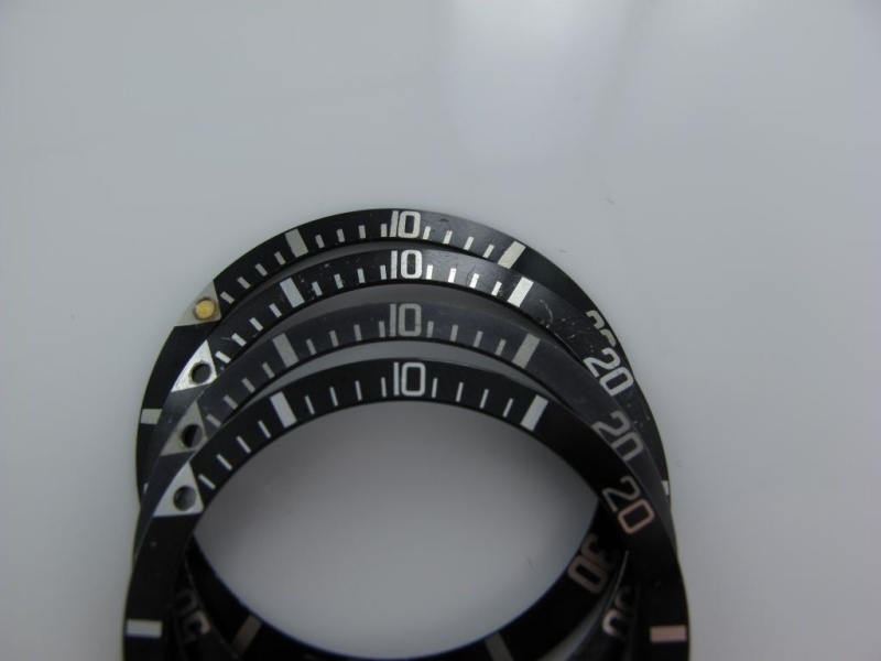
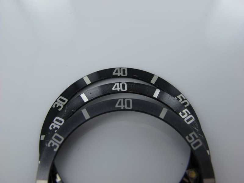
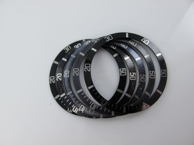
Rolex MK2 fat font - Long 5
The key tell on this one is the long five feature in the 50 marker. It is the interior of the five that is elongated vertically rather than in the MK1 which is square. The exception is of course the MK0.5 or MK1.5 which I will expose later. The fonts are without serifs and fat but not touching in anyway. There is a slight bit more breathing room between the fonts but still very fat. I imagine this one to have been fixed on the 5512, 5513's through the late 1960 up to early 1970. It was probably also the model you would have found on the 1680 "Red Subs". It still remains a highly desirable insert for all vintage submariners.
.
Rolex 5513 Insert - Fat Font MK2
Rolex 5513 Insert - Fat Font MK3"
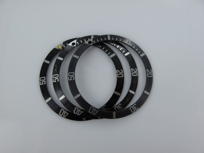
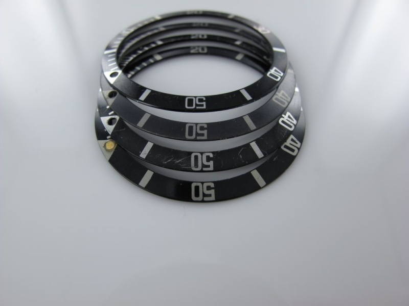
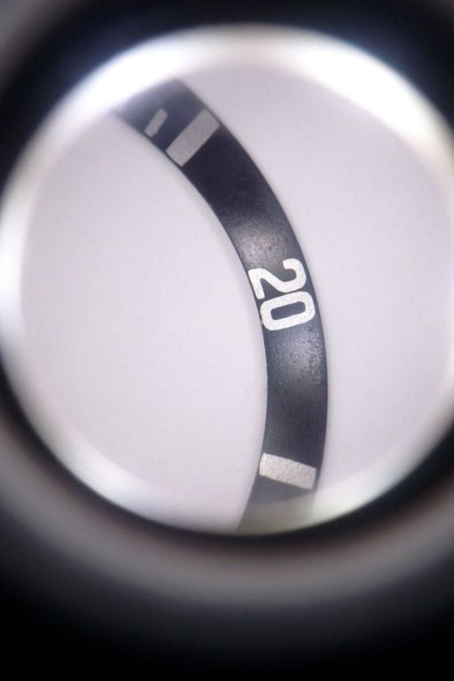
The MK3 fat font seems to be the last of the fat fonts and seems to exhibit some sort of serif in the font style. It appears slightly thinner that the other two. It is the one on the bottom. You can see the little tails on the forty as well as on the 20. The number fifty is again more square but not as small as the MK1.
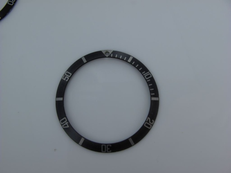
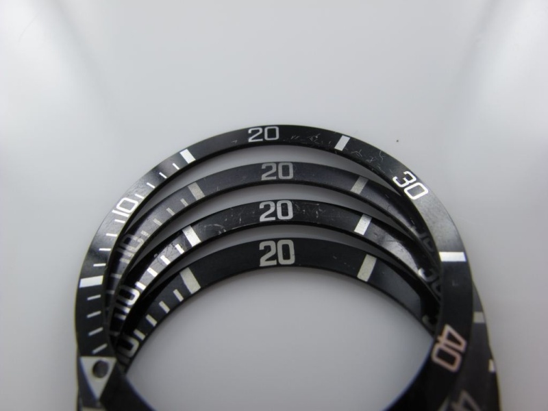
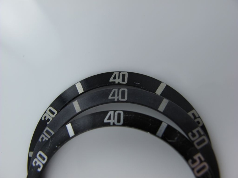
When compared to a fat font insert it is quite evident but when sitting alone it appear to have a solid bold font feel. The fonts are also non serif. This is the insert that graces most vintage subs up to the early 1980s. Maybe even later but it can be considered the last variation. The last sequence of pictures allows you to really see the difference of the MK1-2-3 as compared to the thin font. There are a few other variations which I have not really classified as I am actually not completely sure. First a couple of picture with a broader range on Fat and not so fat inserts.
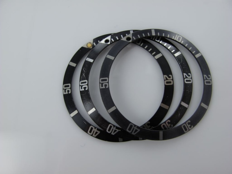
These last two I really did not know how to classify. As promised a MK 0.5 not sure what else to call it. They look like they would have had a red triangle. I had some doubts but they are real and as I always say this is Rolex.
Best
Bill
Espero lo disfruten o lo utilicen algún dia para poder identificar las laminas de los submariner en cualquiera de sus presentaciones.
Disculpen el no haberlo traducido, pero aparaecen palabras demasiado raras para el tema una vez que se traducen del idioma ingles.
Saludos desde el país mas corrupto y vendido de todo el mundo, donde simplemente nunca pasa nada.
Dejo el link para formalidades del foro. https://www.watchprosite.com/?page=wf.forumpost&q=&fi=732&ti=849983&pi=5769208
The Rolex insert is one of the most recognizable aspects of a Rolex Submariner. Often imitated but never duplicated. The Rolex insert is a mark of distinction across the world and the Rolex Submariner is the most recognizable when it comes to dive watches. It was an essential tool for divers to safely calculate their dives long before computers and other sophisticated tools took over.
Some of the very early inserts from the 50's had no markers between the 0-15 they just had individual marks every 5 minute increment. Also we have the famous Red triangle that adorned the Rolex big Crowns in the 1958 – 1959 period. And of course the later Military insert for the 5517 issue with marks at every minute.
source:internet credits unknown .. will credit if noted. pic for reference only
The focus here will be on the inserts that were fitted to the 5512, 5513, 1665 and the 1680. As always with Rolex I must preface this exposé with the fact that we are talking about Rolex and nothing is definitive so please enjoy this review as a guide of an opinion formed by experience. I will use the nomenclature of MK1-3 as it seems to be widely accepted. I will also sneak in a Mk0.5 as one that may have come just before the MK1 but still not stepping on the red triangle insert. However as there are possible variations please feel free to add your comments. Also the inserts are prone to fading and come in an abundant array of shades of gray/black but again I am focused on the base models. They also have a range of pearls that would be affixed tritium and luminova among the most common. I will not covet these accoutrements just the inserts here.
First and most important is to cover main buzz word "Fat Font". What the hell is it with Rolex and fat this and fat that. First the lugs now the fat inserts. Well, when dealing with the time period of the late 50's to early 70's the standard was fat font which I will describe in a minute. Actually I will let the pictures describe it in more detail. The rage on inserts MK1 through MK3 are all fat font with only the service insert being skinny. Again of the vintage period in question. There are degrees of fat which again will be illustrated.
Rolex 5512/5513 Insert - Fat Font MK1
The fat font insert on the above is the early "kissing 40 font". Very rare to find holding the position just after the early Subs after with the red triangle. Here I will present the reference model which is widely accepted as the MK1. This model would have been present on the early 1960's submariner like the 5512 from the gilt era. This would include most likely the 5513 of the same period i.e. a gilt Swiss only ending around 1963/64. Not very common to find these intact on many watches of the period. Key elements to observe is the shape of the five which has a small square with think font. The number forty have the "kissing distinction". I think we can all agree to call this one the MK1. If we then assume the the variations we call MK2 and MK3 as simple slightly less "fat" i.e. the font is from fattest to fat we can draw the distinction. However, I don't have a solid theme to say which watch had which of the inserts exactly what year but you can also assume that the period late 50's through maybe 1961 could be mk1 ans then 1961-63/64 as the MK2 period and then from the 1965 period onward to be the early MK3 variety. But this is only an assumption.
The Characteristics are clear as you can see the fonts are so thick that they are almost touching each other with the exception of the forty which is touching "kissing Forty". The index markers are also very thick. They do appear to be somewhat sloppy but this is a correct feature. You will also notice the shape of the five in the fifty where you can see a small square shape with a slight serif at the tips. The numbers in general have a small serif features to them all not in a traditional sense but like little feet protruding at the ends.
Rolex MK2 fat font - Long 5
The key tell on this one is the long five feature in the 50 marker. It is the interior of the five that is elongated vertically rather than in the MK1 which is square. The exception is of course the MK0.5 or MK1.5 which I will expose later. The fonts are without serifs and fat but not touching in anyway. There is a slight bit more breathing room between the fonts but still very fat. I imagine this one to have been fixed on the 5512, 5513's through the late 1960 up to early 1970. It was probably also the model you would have found on the 1680 "Red Subs". It still remains a highly desirable insert for all vintage submariners.
.
Rolex 5513 Insert - Fat Font MK2
Rolex 5513 Insert - Fat Font MK3"
The MK3 fat font seems to be the last of the fat fonts and seems to exhibit some sort of serif in the font style. It appears slightly thinner that the other two. It is the one on the bottom. You can see the little tails on the forty as well as on the 20. The number fifty is again more square but not as small as the MK1.
When compared to a fat font insert it is quite evident but when sitting alone it appear to have a solid bold font feel. The fonts are also non serif. This is the insert that graces most vintage subs up to the early 1980s. Maybe even later but it can be considered the last variation. The last sequence of pictures allows you to really see the difference of the MK1-2-3 as compared to the thin font. There are a few other variations which I have not really classified as I am actually not completely sure. First a couple of picture with a broader range on Fat and not so fat inserts.
These last two I really did not know how to classify. As promised a MK 0.5 not sure what else to call it. They look like they would have had a red triangle. I had some doubts but they are real and as I always say this is Rolex.
Best
Bill
